How To Make a Graph in Microsoft Excel
Sydney's Seminar
In our last edition of Sydney’s Seminar, we discussed the Pivot Table feature in Microsoft Excel in detail; today, we will add-on to it with How to Make a Graph in Microsoft Excel. Graphs are a great visual to use, especially in presentations or proposals where you need to provide statistics to viewers.
gather data
The first step to creating your graph is to collect your data in a meaningful way that Excel can interpret. This means that your labels should be clear, and the data should be numerical. Don’t worry if your data isn’t numerical; you can transform it by creating a Pivot Table.
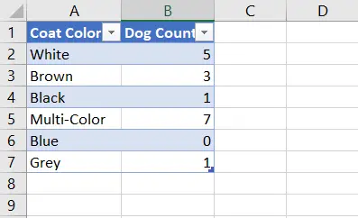
Personally, I find the best way to collect data is to have your independent factor labels in the first column and your dependent factors in the first row.
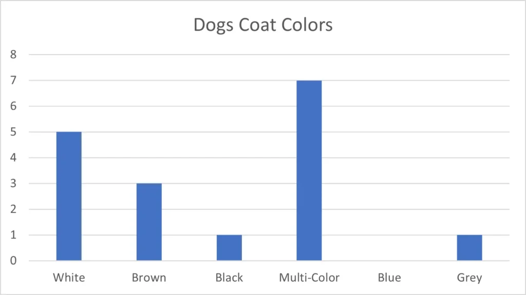
In this example, I count the dogs with specific coat colors at a doggy daycare. My independent factor is the dog’s colors, which will not vary with the data. My dependent factor will be the variable that does change from case to case, which is the dog count.
insert graph
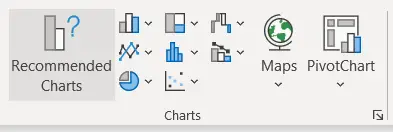
Now that we have a complete set of data to review, it’s time to create the graph. To do this, you want to highlight all the data by clicking cell A1 and dragging your cursor to the bottom-right cell of your data (in my case, B7). Then, you will click the “Insert” tab in the top ribbon with the cells highlighted. Navigate to the section that is labeled “Charts” (shown below).
Unless you have a particular graph in mind, it’s best to start with “Recommended Charts.” This tool will show you the graphs that best suit your dataset and provide a preview of what your graph will look like. The type of graphs Excel offers depends on how the data is organized and your overall format.
graphical options
In the “Recommended Charts” pop-up, you’ll see two tabs up at the top. If you click “All Charts,” you’ll see every possible chart type that you can use to represent your data. In this example, I will be working with a Column Chart, so I will click “Column” in the left-hand options and select my preferred graph. Once I hit OK, the chart will appear next to my data in the spreadsheet.
editing the graph
When you click on the graph, your ribbon automatically toggles to the Chart Design function. Here, you can change your graph’s colors, layout, and style if you want to customize it. You could also add an aspect to the chart by clicking “Add Chart Element.” One of these options is a personal favorite, the “Trendline” feature. This is an excellent way to normalize your data, especially if the data is over time.
The graph can be clicked and dragged wherever you want it in your Excel sheet, and you can copy and paste it into whichever document you would like it to show.
If you need to edit the data or add to it, no worries, the graph will change with your edits! To edit particular labels in the graph, you only need to click on the label.
I hope you found this How-To guide helpful. If you have any difficulties with Excel or would like additional training, give us a call at 301-456-6931 or email us at [email protected]
Have a great day!

Sydney Clark
Director of Operations
Being raised by Clark’s owner, Darren, I have always been immersed in the world of technology. However, I have always followed it from a distance. I went to college to get my degree in Business Finance and Applied Economics, as I have always been a fan of research and statistics. I was even lucky enough to get my senior thesis in economics published. My next string of luck was getting a job straight out of college as a Researcher in Richmond, VA. I was able to pursue research and publish dozens of news articles in my field. Now, I am so excited to delve back into the world of technology that I was raised in, and look forward to honing my research in the technological field.